Hey everyone, Alex here. I can’t believe it’s been a month since my last post. Time flies! Well, let me tell you what we’ve been up to in these last few weeks.
Radu and I were planning to write a series of tech articles on some specific physics problems we’ve encountered and how we solved them. Second Hand is physically driven and we spent quite a bit of time in the last month solving the problems that derive from this physicality. Tech articles take a while to write though and we’ve still got loads to do for the prototype so you’ll have to wait a bit more to see how we solved all of the physics in Unity!
Oh, hey, we also made this disco ball:
Meanwhile, the art team has been very busy. We had already started creating a bunch of different assets (parts, props, etc.) for our demo level but as we struggled to do way too much at the same time we realized that we may have skipped a step… Our art style wasn’t quite properly fleshed out yet. To make things worse, we also hadn’t considered some very important aspects of how we will render the game, aspects that affect how assets are created and could invalidate a lot of the work we had already done.
So after realizing our mistake, we spent quite a bit of time researching and answering some key questions like:
- What’s our shape and silhouette reference for the level design?
- What is our main color palette (i.e. our chromatic mood)?
- Dark characters on light background or vice-versa?
- Do we use forward or deferred rendering path? (Answer: deferred)
- Do we use linear or gamma color space? (Answer: linear)
- Do we do use PBR or basic lighting? (Answer: PBR)
Not very glamorous work but very important nonetheless. These are all critical points that significantly impact how we build assets as well as the mood that we can create.
We’ve almost nailed down the answers to all of these questions and will resume building out parts and props. There’s a really nice piece of concept art being finalized now that captures the mood we’re going for. Look out for it soon!
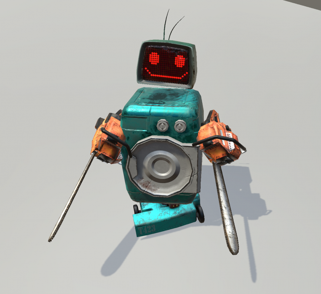
Meanwhile, here’s an image of a PBR-rendered Fat Frankie. Just look at that pretty, shiny body of his!

That’s it for today. Follow us on Facebook or Twitter if you’d like to get a stream of quick updates and embarrassing screenshots (stylish ones will be coming up).
Stay chipper!

